Product Feature Layout
Description
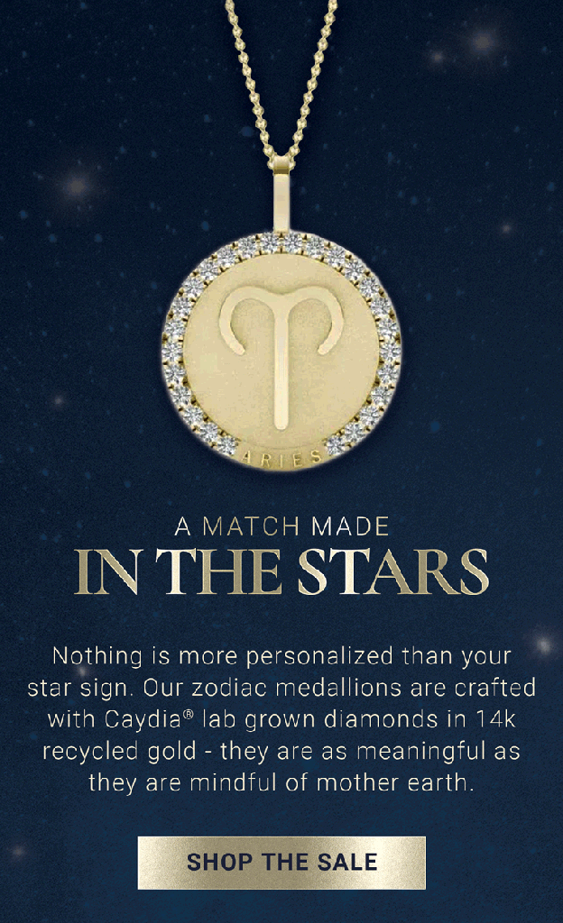
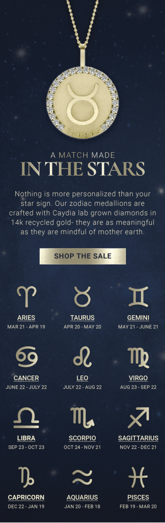
For this email, I was tasked with creating an email layout that featured all of our Zodiac collection. For the hero, I decided to create a .GIF featuring all of the pendants to showcase the whole collection. I also utilized our gold foil treatment on the CTA and on each astrological sign icon to convey a luxurious and ethereal experience. I wanted this email to feel immersive, so I carried the image of the starry sky throughout the entire email as well.
Editorial Layout
Description
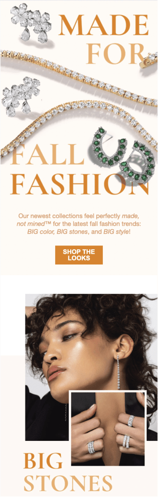
At the time I created this email layout, we were without an email template that felt engaging and editorial. I wanted to feature product in our hero and to utilize on figure imagery to tell a holistic story. For this layout in particular, we wanted to showcase fall fashion that was “big” or “over the top”. We continue to use this layout for emails that we want to be image heavy to promote our product.

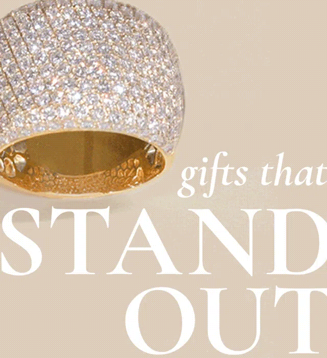
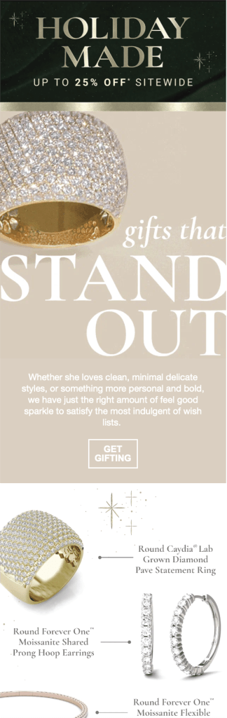
The Gift Guide LAyout
Description
This layout I created because I wanted email product to feel more “curated”. Our emails also previously mostly featured products with their respective prices, which I felt drove some consumers away. Therefore, I created a layout that featured product in a way that allowed the product to feel more personal, while intriguing the consumer to click, and therefore driving up our click-through rates. We now use this layout prominently in many of our emails.
The “Genny” template
Description
For this email, I wanted to create generic, shoppable categories that felt compelling to click on. I grabbed dynamic product shots from our website that didn’t feel flat or stale, and created an easy, modular template in which we could easily swap out product and product titles. This template often allows for our emails to be both easy to build and beautiful for the user/consumer.

IN CASE YOU DIDN’T CLICK 😉
Below is a preview of each email’s layout

Leave a comment